Every Amazon product tells a story. It begins with a launch, rises to popularity, stabilizes, and eventually fades. This journey is the amazon product lifecycle, and understanding it is the single most powerful way for sellers and analysts to make smarter, data-driven decisions. While many sellers rely on intuition, the most successful ones use historical data to see the full picture. They don't just see today's price and rank; they see the entire movie, not just a single frame.
This guide moves beyond theory. We will demonstrate how to perform a comprehensive amazon product lifecycle analysis using 12 months of historical sales data. You will learn how to programmatically identify each lifecycle stage, detect seasonality, spot trend reversals, and benchmark launch performance. We'll do this using real-world data accessible through an API and visualize it with practical Python code examples, creating a powerful dashboard that your competitors wish they had.
The Four Stages of the Amazon Product Lifecycle
The classic product lifecycle model, which includes Introduction, Growth, Maturity, and Decline, applies perfectly to the Amazon marketplace. The key is knowing how to identify which stage a product is in using concrete data signals, not just guesswork. Understanding each stage of the amazon product lifecycle allows you to make decisions that are aligned with market reality rather than wishful thinking.
1. Introduction Stage
This is the product's launch phase. Sales are low, BSR is high (meaning a worse rank), and reviews are non-existent. The primary goal is to gain initial traction and visibility. Data signals for this stage include low but slowly increasing sales velocity, a high BSR, and a low review count. During this phase, advertising spend is typically at its highest relative to revenue, as you are essentially buying visibility in a market that doesn't yet know your product exists. Sellers who understand this stage invest aggressively in PPC campaigns and external traffic to accelerate the transition to the growth stage.
2. Growth Stage
If a product gains traction, it enters the growth stage. Sales volume increases rapidly, BSR improves dramatically (moving closer to #1), and customer reviews start accumulating. This is where a product proves its market fit. Key data signals are a steep upward trend in sales, a sharp downward trend in BSR, and an accelerating number of new reviews. The growth stage is the most exciting phase but also the most dangerous. Competitors notice your success and begin entering the market. Inventory management becomes critical, as a stockout during peak growth can permanently damage your ranking and hand market share to competitors.
3. Maturity Stage
After a period of rapid growth, the product enters the maturity stage. Sales volume peaks and stabilizes, BSR settles into a relatively consistent range, and the market becomes more saturated with competitors. The focus shifts from rapid growth to defending market share and optimizing profitability. Data signals include plateauing sales, a stable BSR, and increased offer counts from competing sellers. In the maturity stage, the battle is won on margins and differentiation. Sellers who can maintain a lower cost structure or offer a meaningfully better product will continue to thrive, while those who compete solely on price will find their margins compressed.
4. Decline Stage
Eventually, sales begin to decline. This can be due to market saturation, new competition, or changing consumer preferences. BSR starts to worsen, and sellers may need to lower prices to maintain sales. Data signals are a consistent downward trend in sales, a rising BSR, and potential price erosion. Recognizing the decline stage early is critical. Sellers who identify it quickly can liquidate inventory at a profit, while those who miss the signal end up holding excess stock at a loss. Historical data is the only reliable early warning system for this transition.
Unlocking the Data: 12 Months of History with an API
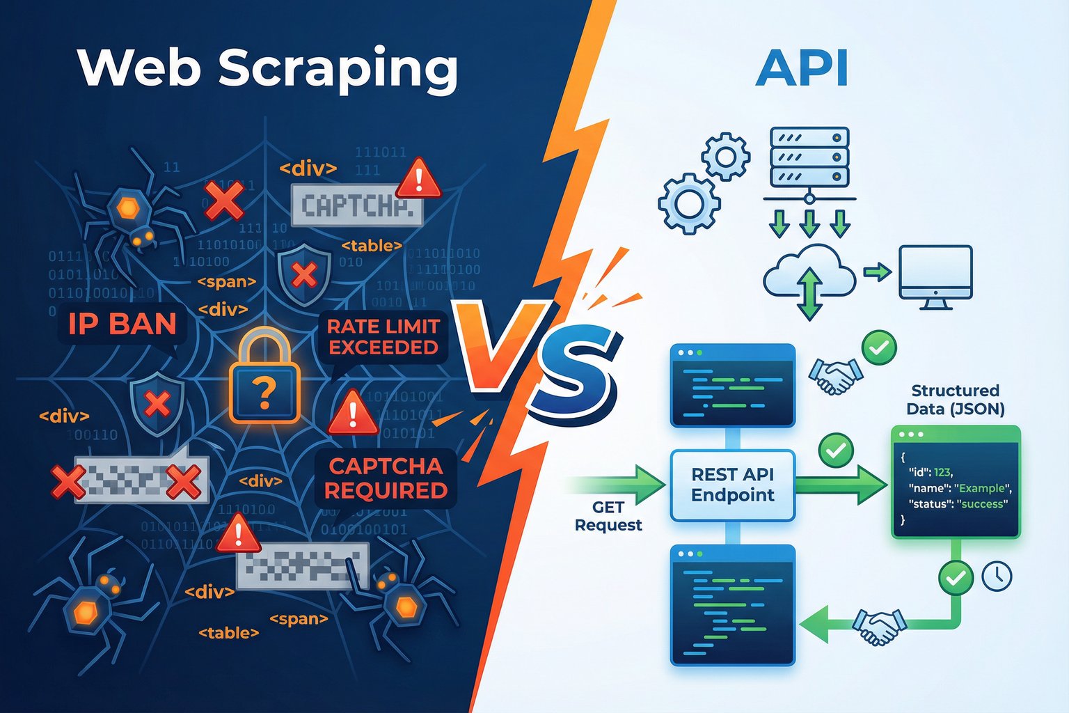
To visualize the amazon product lifecycle, you need historical data. While Amazon Seller Central provides some analytics, it often lacks the granularity and long-term view needed for true lifecycle analysis. This is where a dedicated data API becomes essential. The Easyparser Sales Analysis and History API provides up to 12 months of weekly aggregated data for any product, including all the data points needed to build a complete lifecycle picture.
The API returns a history array where each element represents one week of performance data. The fields available in each weekly record are:
| Field | Description | Use Case |
|---|---|---|
date | Start date of the week | X-axis for all charts |
purchases | Estimated units sold that week | Sales velocity chart, lifecycle stage detection |
best_seller_rank | BSR position that week | Rank trend chart, trend reversal detection |
average_price | Average Buy Box price that week | Price history chart, pricing strategy analysis |
total_offers | Number of competing sellers that week | Competition tracking, maturity stage detection |
review_count | New reviews added that week | Review velocity chart, growth stage confirmation |
views | Product page views that week | Traffic analysis, conversion rate calculation |
With a single API call, you can retrieve the complete dataset needed to chart the entire lifecycle. Here is a Python snippet showing how to make that request:
import requests
import json
API_KEY = "YOUR_API_KEY" # Get your key from app.easyparser.com
ASIN = "B098FKXT8L"
params = {
"api_key": API_KEY,
"platform": "AMZ",
"operation": "SALES_ANALYSIS_HISTORY",
"asin": ASIN,
"domain": ".com",
"history_range": "12"
}
response = requests.get("https://realtime.easyparser.com/v1/request", params=params)
data = response.json()
# The 'history' array contains the weekly data points
history_data = data.get("result", {}).get("history", [])
# The product object contains launch_date, age, and current performance
product_data = data.get("result", {}).get("product", {})
launch_date = product_data.get("launch_date")
print(f"Product launched: {launch_date}")
print(f"Historical weeks: {len(history_data)}")
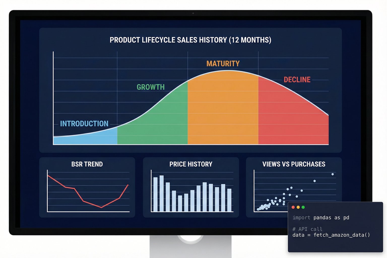
Visualizing the Lifecycle with Python and Plotly
Raw data is only useful when it is visualized. The following Python code takes the weekly history array returned by the API and creates an interactive multi-panel chart that clearly shows the product's lifecycle stage, BSR trend, price history, and review velocity. This is the kind of visualization that turns a spreadsheet into a strategic tool.
import pandas as pd
import plotly.graph_objects as go
from plotly.subplots import make_subplots
# Convert the history array to a DataFrame
df = pd.DataFrame(history_data)
df["date"] = pd.to_datetime(df["date"])
df = df.sort_values("date")
# Create a 2x2 subplot grid
fig = make_subplots(
rows=2, cols=2,
subplot_titles=("Weekly Sales (Purchases)", "BSR Trend", "Price History", "Review Velocity")
)
# Row 1: Sales and BSR
fig.add_trace(go.Scatter(x=df["date"], y=df["purchases"], fill="tozeroy", name="Sales"), row=1, col=1)
fig.add_trace(go.Scatter(x=df["date"], y=df["best_seller_rank"], name="BSR"), row=1, col=2)
# Row 2: Price and Reviews
fig.add_trace(go.Scatter(x=df["date"], y=df["average_price"], name="Avg Price"), row=2, col=1)
fig.add_trace(go.Bar(x=df["date"], y=df["review_count"], name="New Reviews"), row=2, col=2)
fig.update_layout(title="Amazon Product Lifecycle Dashboard", height=700)
fig.show()
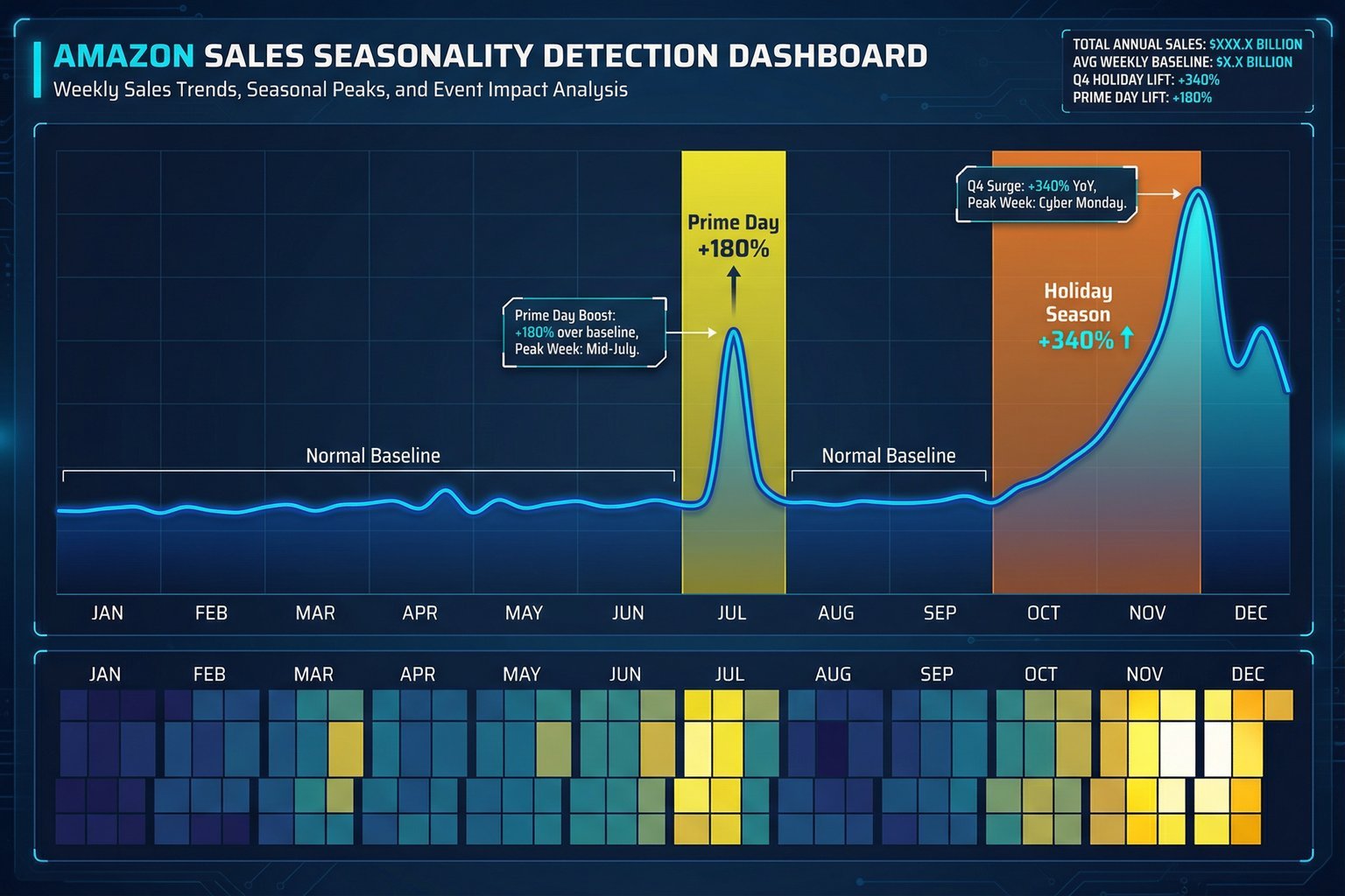
Advanced Analysis: Seasonality and Trend Reversals
A 12-month dataset doesn't just show the basic lifecycle; it reveals deeper patterns that are critical for inventory planning and competitive strategy. The ability to detect these patterns is what separates sophisticated sellers from those who are perpetually caught off guard by demand shifts.
Seasonality Detection
Many products have predictable seasonal demand. By plotting 12 months of sales data, you can instantly spot these patterns. For example, a toy might see a massive sales spike in Q4 (October-December), while a fitness product might peak in January. Identifying these seasonal trends allows for precise inventory planning, preventing stockouts during peak demand and avoiding overstocking during slow periods. A 30% reduction in inventory holding costs is a realistic goal for businesses that master seasonality-based ordering. The weekly granularity of the historical data is particularly valuable here, as it allows you to pinpoint not just which month is your peak, but which specific week, enabling tighter inventory management.
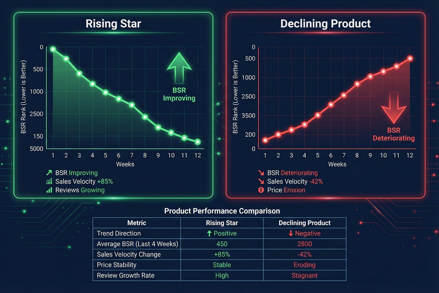
Trend Reversal Identification
Is a product a rising star or a falling knife? Historical BSR and sales data provide the answer. A product with a consistently improving BSR and growing sales velocity is a rising star, representing a strong investment opportunity. Conversely, a product with a deteriorating BSR and declining sales is a declining product, signaling that it may be time to divest or pivot. This analysis is crucial for both sellers managing their own catalog and investors evaluating potential acquisitions. The offer count history is also a valuable signal here: a sudden increase in the number of competing sellers often precedes a price war and signals the beginning of the maturity or decline stage.
Benchmarking Launch Performance
How do you know if a product launch is successful? By benchmarking it against others. The API provides the launch_date for any product, allowing you to compare the BSR and sales trajectory of your launch against competitors in the first 4, 8, and 12 weeks. This data-driven approach to launch analysis helps you understand what a "fast" vs. "slow" launch looks like in your specific category, enabling you to set realistic performance targets and adjust your marketing strategy in real-time.
For online arbitrage and wholesale buyers, this benchmarking capability is particularly powerful. Before sourcing a product, you can check the launch date of the current top seller and analyze how quickly they reached their current rank. If a competitor achieved BSR #500 in 6 weeks, you know the category is highly competitive and requires a significant launch investment. If the top seller took 18 months to reach the same rank, the category may be more accessible.
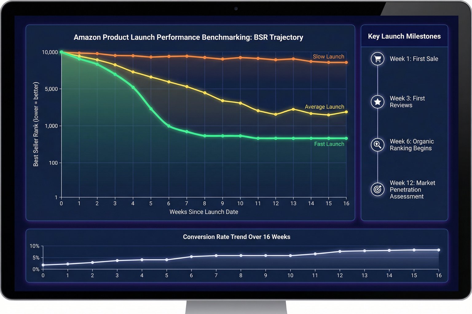
Conversion Rate Analysis: Views vs. Purchases
One of the most underutilized capabilities of historical sales data is conversion rate analysis. The API returns both views (traffic) and purchases (sales) on a weekly basis, allowing you to calculate the true conversion rate for any product over time. A product with high views but low purchases is a product with a conversion problem: the listing is getting traffic but failing to convert it into sales. This pattern is a significant market opportunity. If you can identify a product with strong demand (high views) but weak conversion (low purchase rate), you can potentially enter the market with a better listing and capture that existing demand.
Conversely, tracking your own product's conversion rate over time reveals the impact of listing optimizations. If you update your main image and your conversion rate improves in the following weeks, the weekly data confirms the change was effective. This kind of closed-loop analysis is only possible with granular historical data.
From Data to Decisions: Real-World Use Cases
Analyzing the amazon product lifecycle is not just an academic exercise. It is a strategic imperative that directly impacts profitability. The following table summarizes the key use cases and the specific data signals that drive each decision.
| Use Case | Key Data Signals | Decision Enabled |
|---|---|---|
| Product Research | Launch date, BSR trajectory, sales velocity in first 12 weeks | Identify fast-growing categories and benchmark launch expectations |
| Inventory Planning | Weekly sales history, seasonal spikes, Q4 and Prime Day patterns | Reduce inventory costs by 30% through seasonality-based ordering |
| Competitive Analysis | Offer count history, competitor BSR trends, price history | Identify when competitors are struggling and capture market share |
| Trend Forecasting | 12-week moving average of BSR and sales, review velocity | Predict future demand and adjust sourcing lead times accordingly |
| Listing Optimization | Views vs. purchases ratio over time | Measure the impact of listing changes on conversion rate |
By leveraging historical data, sellers can optimize inventory to align with seasonal demand and lifecycle stage, refine pricing strategy based on whether a product is in a growth or maturity phase, improve marketing ROI by allocating advertising spend more effectively, and make smarter sourcing decisions by identifying rising stars and avoiding declining products.
Ready to Visualize Your Product's Full Story?
Easyparser's Sales Analysis and History API gives you up to 12 months of weekly historical data for any Amazon ASIN. Start building your own amazon product lifecycle dashboards today.
Start Free TrialAmazon product lifecycle dataStart analyzing Amazon data for free
Start Your Free Trial100 free credits, no credit card required.